The day before Easter, I tried to get as much work done as I could so that on Easter Sunday I could take the day to relax and enjoy time with family. The morning flew by, Sundays are usually busy for us, and we didn’t get home until the afternoon after grocery shopping. I spent the evening with my youngest brother, who wanted to draw together. He painted a bunny under a sunny sky while I doodled in my sketchbook.
Before you decide to step into the pool of simplified logos, there are an abundance of things you need to take into consideration like you audience and brand. Going through a logo change with no thought of these things could lead to you loosing engagement, or building a bad rep.
Thinking about these things will raise your respect within your community, and folks will always find familiarity with your business!
Logo simplification, it works sometimes, and others it doesn’t, but in some cases these simplifications make no sense! Changing the logo not only changes peoples feelings about your company, but sometimes the change can be so drastic that it takes away the character and feel in a logo, and/or people don’t even recognize the logo anymore.
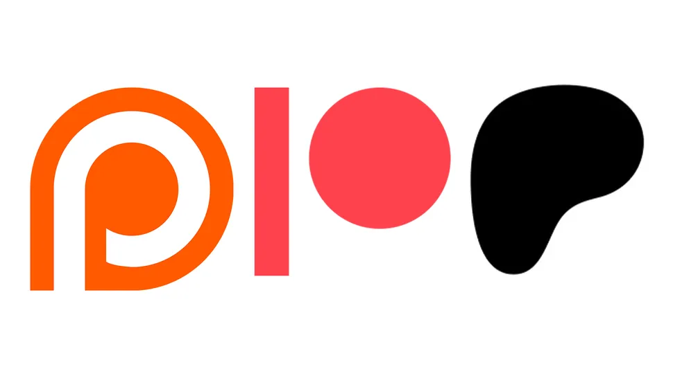
First case is Patreon, which truly has gone downhill after their first logo. Their second design features a thinner rectangle next to a circle which is meant to imitate the P… not only does this design not look much like a P, but it’s drastically different in a way that these designs don’t even feel like their are for the same company. Truly their worst is the most recent version which features a blob meant to look like the P, and I can be the first to admit, I have gotten lost looking for their app after that one. it’s unrecognizable, and the simplification has gone too far.
Patreons logo simplification from a P to a stick and circle to a blob… Confusing!