

Oversimplifying logos is something I think we see a lot of nowadays. With times changing, and simple/minimalistic design being fairly popular of course brands would catch on a try and jump on that train. But are these re brands that logos are undergoing really all that bad? I’d say it depends on not only the design choices that company makes, but also what the company does.
After watching the video on simplified logos, I had a few thoughts. In the case of Discord, I like the color change, the new “Blurple”, In my opinion, Discord is the kind of brand who would use a more saturated color due to what their company does, It just seems “right”. But whereas I think the color update is very nice, I am not a big fan of the type change. Although I’m sure readability was improved, this change feels very round, soft, and small in a way that Discord simply isn’t. I think the old type had nice character.

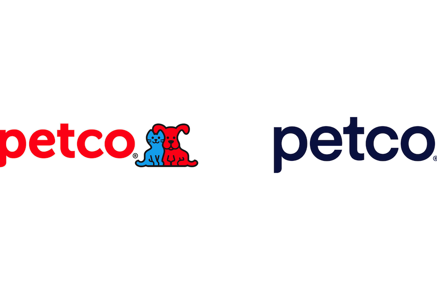
In addition, Petco changing their logo but not including the dog and cat logo made them feel less fun and inviting. With the smiles on the animals faces they look happy to be at Petco, so I know my dog will be happy there, but taking that away makes them feel more like a pet store I would visit by myself and not bring my dog with. Even the color change from the brighter red to the darker blue makes it feel less inviting.
Overall, I think there’s a right time and place for some logos to change, but not all companies need to change their logo to be more simplified or “modern”. Some brands that have been around for forever have already established a look that works for them, and whereas it might not be simple or modern, it does what it need to do which is represent their brand and company.