
Logo simplification, it works sometimes, and others it doesn’t, but in some cases these simplifications make no sense! Changing the logo not only changes peoples feelings about your company, but sometimes the change can be so drastic that it takes away the character and feel in a logo, and/or people don’t even recognize the logo anymore.
First case is Patreon, which truly has gone downhill after their first logo. Their second design features a thinner rectangle next to a circle which is meant to imitate the P… not only does this design not look much like a P, but it’s drastically different in a way that these designs don’t even feel like their are for the same company. Truly their worst is the most recent version which features a blob meant to look like the P, and I can be the first to admit, I have gotten lost looking for their app after that one. it’s unrecognizable, and the simplification has gone too far.
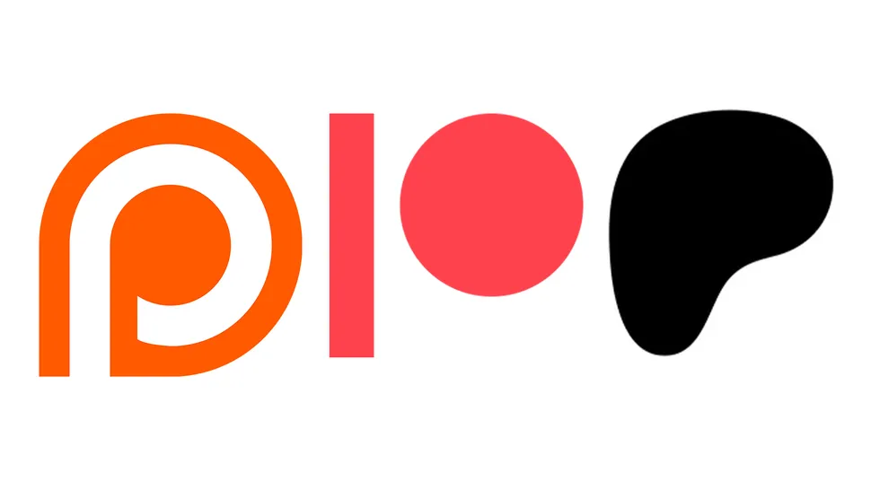
Patreons logo simplification from a P to a stick and circle to a blob… Confusing!